
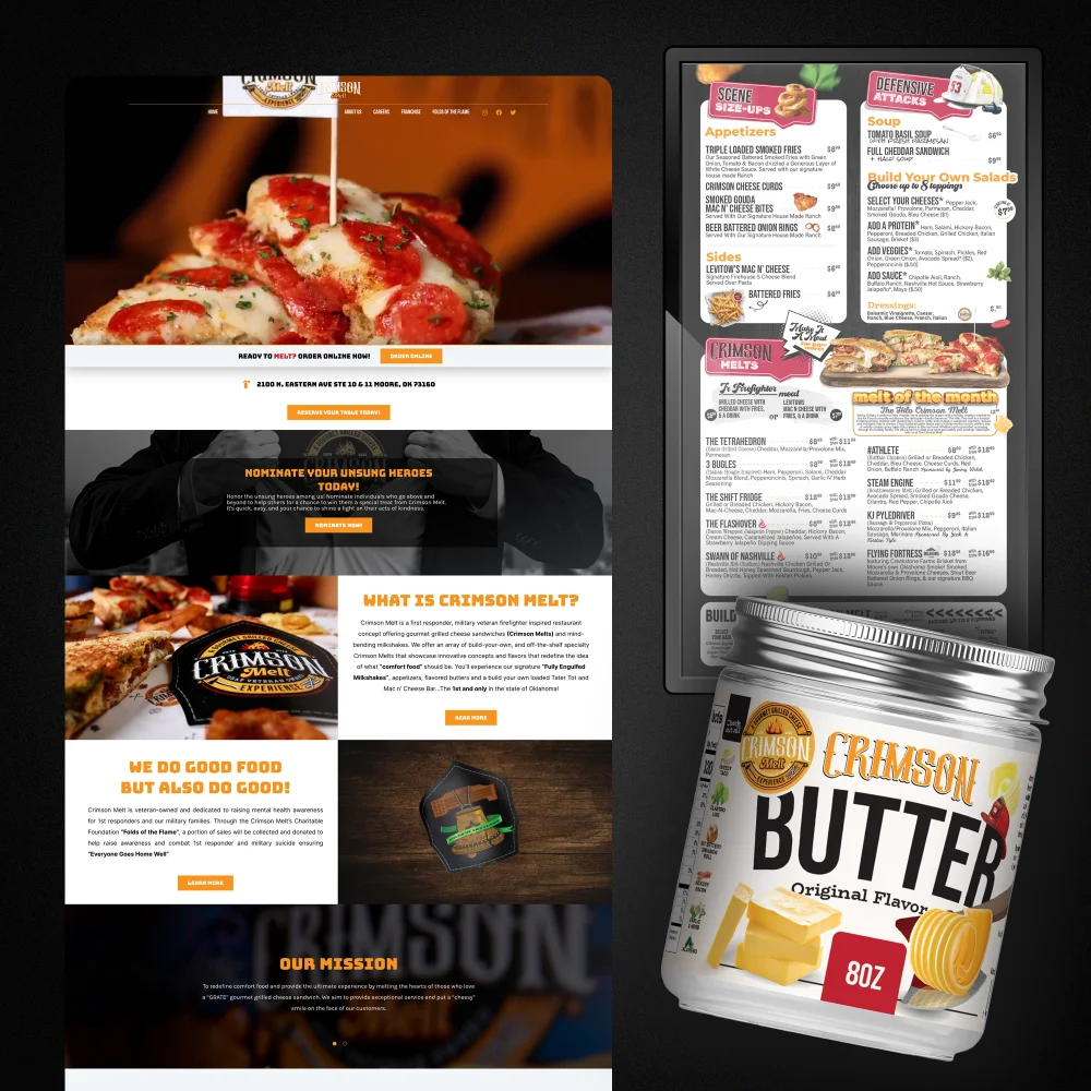
A restaurant’s design has to work in several places at once. Someone discovers the business online, opens a menu at the table, then takes a branded product home. Those experiences should feel connected, even though each asks the design to do a different job.
Our Crimson Melt portfolio brings three of those pieces together: a website, a restaurant menu and Crimson Butter packaging. Looking at them side by side offers a useful way to think about consistency across a hospitality brand.
Start with the food
The website leads with a close-up of a melt and a generous pour of cheese. The food takes up more space than the navigation. Orange accents pick out actions and headings, while darker sections give the photography room to stand out.
That is a practical choice for a food business: show visitors what they can expect to eat, then make the next action easy to find. In the portfolio image, the online-ordering prompt sits directly below the main food photograph. The page also makes room for the people and story behind the restaurant.
For your own website, decide which action matters most before choosing a layout. Ordering, booking a table and finding opening hours need different routes. A beautiful opening image works best when visitors can see where to go next.
Give the menu structure
The Crimson Melt menu has plenty of personality: illustrated details, expressive headings and food photography. Beneath that character is a clear structure of sections, dish names, descriptions and prices.
Each layer needs a different level of attention. A section heading helps guests find their way. A dish name helps them scan. A description answers questions about what is included. When those layers look equally prominent, a long menu becomes harder to use.
Before adding decoration to a menu, test its structure using the actual dishes and descriptions. A layout that looks spacious with placeholder text may become crowded once the full menu arrives.
Let packaging do its job
The Crimson Butter jar uses the same appetite-led world in a different format. The product name is prominent, the brand mark remains visible, and butter imagery tells the customer what is inside. The label is composed for a small curved surface rather than a screen or a menu board.
This is where consistency needs some flexibility. Reusing the same colours, typography and visual character can connect the pieces, but repeating a website layout on a label would ignore how the object is handled and read.
Packaging also brings production questions into the design brief: label dimensions, available print area, materials and required product information. Those details should be established before artwork is prepared for production.
Review the pieces together
A useful brand review puts the website, menu and packaging on the same screen or table. Look for repeated colours, type choices, image treatment and tone of voice. Then check whether each piece still performs its own task clearly.
- Can a new visitor find the main website action?
- Can a guest scan the menu’s sections and prices?
- Can a customer recognise the packaged product at a glance?
- Do all three pieces feel like they belong to the same business?
The Crimson Melt work is a visual example of that connected approach. Its website, menu and packaging each use a different composition while keeping a recognisable food-focused personality.
Planning your next project?
Start by listing the places where customers encounter your brand. You may need a single menu, or a group of pieces that work together across print and web. That list makes a much more useful starting point than choosing a style in isolation.
Tell Avem Noctis about your project and include the materials you already have, the pieces you need and your intended launch date.