
Titan’s Pho
signage design.
From a sidewalk promotion to the counter menu.
Restaurant signage and menu artwork by AVEM NOCTIS. The Titan’s Pho project connects opening and lunch promotions, digital menu boards and printed menus through red accents, food photography and clear categories.
Explore signage design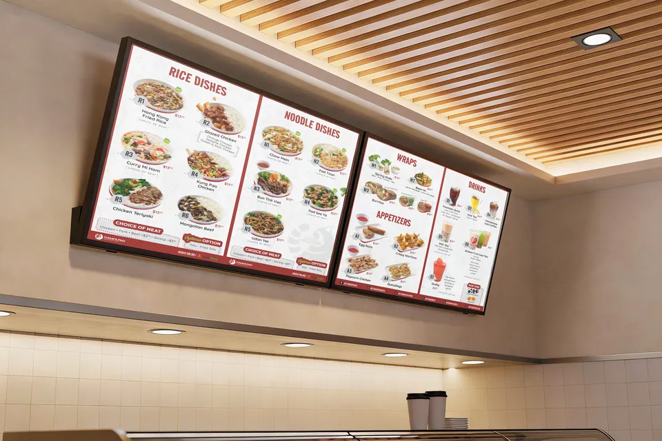
Different moments to read.
The set covers three distinct situations: noticing an offer outside, choosing food at the counter and reading a printed menu up close. Each asks for a different balance of headline, image and detail.
This case study follows the finished designs through those situations. The recurring colours, food imagery and type treatment connect the work, while the amount of information changes with the format.
The work in the set.
- A red opening-promotion A-frame design
- A lunch-special sidewalk poster
- Digital menu boards above the counter
- A two-sided printed restaurant menu
The project shows how restaurant graphics can share a visual language across promotional and everyday ordering materials. Each piece has a specific message to carry.
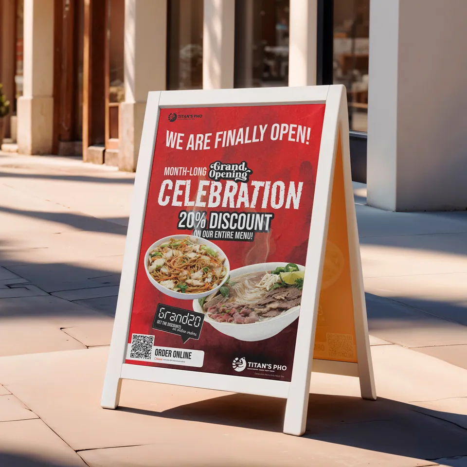
Announce the opening.
The opening sign uses a broad red field and large lettering to lead with the announcement. The promotional offer sits beneath it, with food images giving the message a direct connection to the menu.
Smaller details occupy the lower part of the layout. The design creates a reading order: opening message, offer, food and next action. That hierarchy lets the headline carry the first glance without asking every line to compete at the same size.
The offer shown belongs to the project artwork; it illustrates the promotion’s layout rather than a current restaurant offer.
Give lunch its own focus.
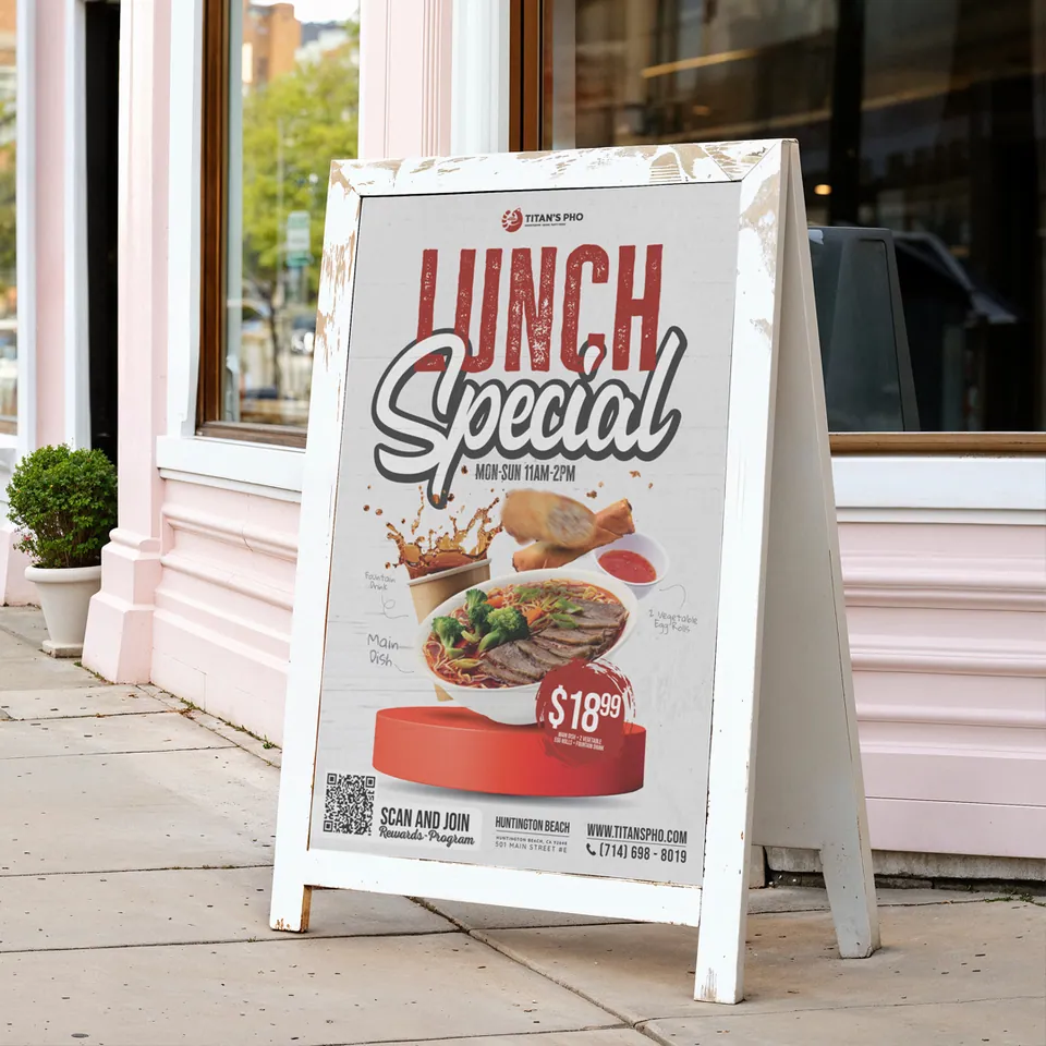
The lunch design changes the balance. A light background supports a large red heading and script lettering, with the food composition concentrated in the middle. The offer price becomes a separate point of emphasis beside the meal.
It belongs to the same family as the opening sign through its colour and food imagery, but it does not repeat the same layout. A lunchtime promotion needs to explain a particular offer, so the design gives that combination room.
The comparison shows why a useful restaurant design system needs flexibility. Recognisable ingredients can be rearranged around a different message.
Organise the counter view.
The digital boards introduce a wider range of information. Rice dishes, noodle dishes, wraps, appetisers and drinks are arranged into categories across the screens. Red headings help separate the groups, while individual food photographs sit with the corresponding menu items.
Light backgrounds give the dishes and text a consistent setting. The composition repeats a structure across the screen set so the menu can be read as connected sections. Screen count and menu length make this a different layout problem from the single-message sidewalk signs.
Our restaurant signage and digital menu board design service explains the specifications and content needed to plan a similar set.
Bring the detail closer.
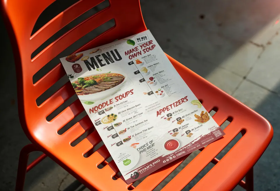
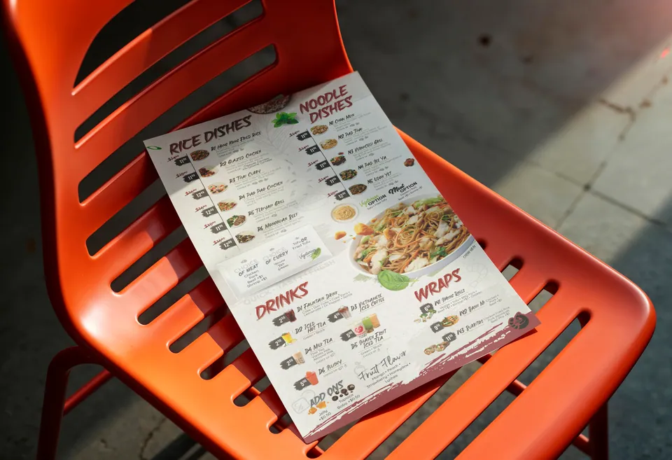
The printed menu carries the same red category headings and food-led character into a format customers can hold. One side brings noodle soups, customisation and appetisers together; the reverse groups other dishes, drinks and wraps.
Its denser information is organised through headings, spacing and item groupings. The shared visual language connects it to the counter boards, while the composition responds to a different shape and reading distance.
See our restaurant menu design service for the scope behind printed layouts and coordinated menu versions.
Consistency across the set.
Red acts as a recurring signal, moving from the dominant field on the opening sign to headings and accents elsewhere. Food photography makes the menu tangible, while light backgrounds support the longer lists.
The finished set demonstrates a consistent relationship between colour, imagery and information. It gives the restaurant related materials for both promotions and ordering without forcing every surface into the same arrangement.
For planning your own signs, our street-to-table signage guide explores what customers need to understand at each point in a restaurant.
Plan your restaurant’s set.
Start by listing the places where customers encounter your menu or an offer. Photograph the display positions, confirm the dimensions and gather one approved source for dish names, prices and descriptions.
Then decide which pieces need to work together at launch and which will change regularly. Explore signage and digital menu board design, or our brand identity service if the visual foundations need developing first.
Let’s plan your signage.
Tell Ivana and Levent which signs or screens you need, where customers will see them and when the artwork needs to be ready. We’ll use those details to propose a scope.
Discuss a signage projectPrefer email? Write to our studio.