
Splitshift
brand identity.
A script. A checkerboard.
A character that carries.
AVEM NOCTIS created Splitshift’s identity. This case study looks at the wordmark, colour and graphic pattern that connect its packaging and print, and how the system changes across different surfaces.
Explore brand identity design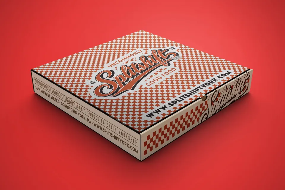
The identity as a system.
The work brings expressive script lettering together with a red-and-white checkerboard. The wordmark supplies the name and personality; the pattern creates a recurring visual connection around it.
Those elements appear across the pizza box, takeaway bag, cup and printed materials. Seeing the pieces together reveals what remains consistent and what changes with the format.
The wordmark leads.
The flowing script gives Splitshift’s name a distinctive shape. Its slanted rhythm contrasts with the straight, repeating geometry of the checkerboard.
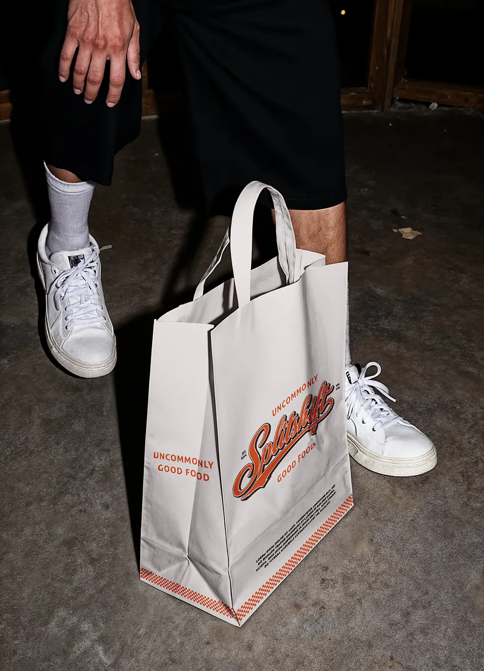
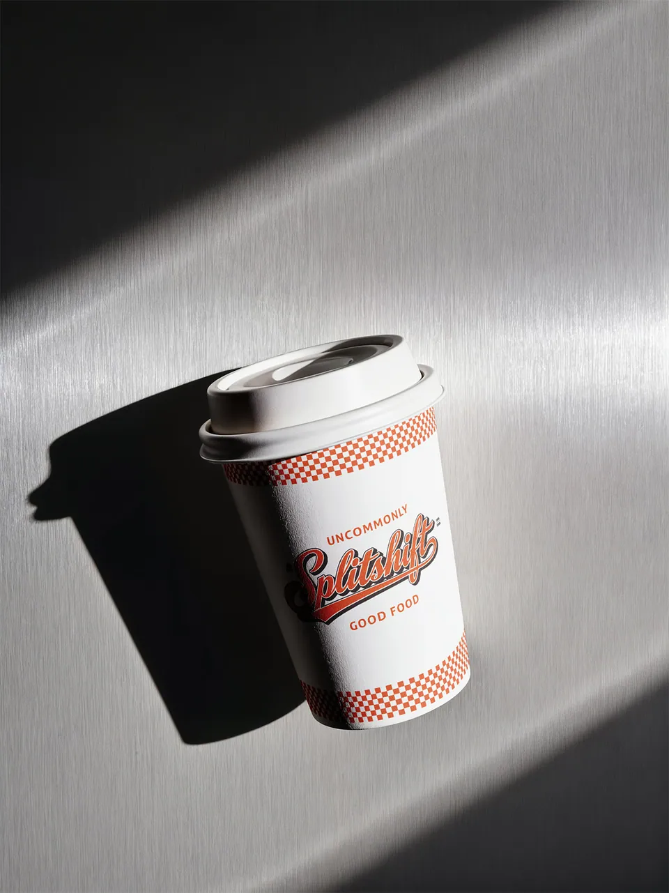
On the pizza box, the name sits prominently over the patterned field. On the bag and cup, a lighter background gives the lettering more room. The same identity can lead in both settings because the surrounding composition adapts.
Colour with a clear role.
Red carries through the lettering and pattern, with white providing space around the identity. Dark details give the script additional definition.
The bag shows the balance particularly clearly. A large white front supports the central name, while red lettering and checkerboard detail connect it to the denser box design.
The useful lesson is about roles as well as colours. A palette becomes easier to apply when the design establishes which elements should attract attention and where the composition needs breathing room.
A pattern that belongs.
The checkerboard gives the identity a graphic element beyond the name. It can cover a broad surface, form a border or become a narrow band without losing its relationship to the other pieces.
On the box it is an all-over field. On the bag it gathers near the base. On the cup it frames the central lettering. Those changes let the pattern support the object instead of competing with every other element.
The repeated geometry also gives a deliberate contrast to the wordmark’s curves. Together, they create a visual language with both movement and structure.
Recognition without repetition.
A consistent identity does not require an identical layout on every item. Splitshift’s box, bag and cup have different proportions and are viewed in different ways. The amount of pattern and white space changes accordingly.
What stays recognisable is the relationship between the name, colour and checkerboard. That shared foundation gives each new composition something to build on. Our Splitshift packaging case study examines the physical formats and artwork placement in more detail.
Character meets information.
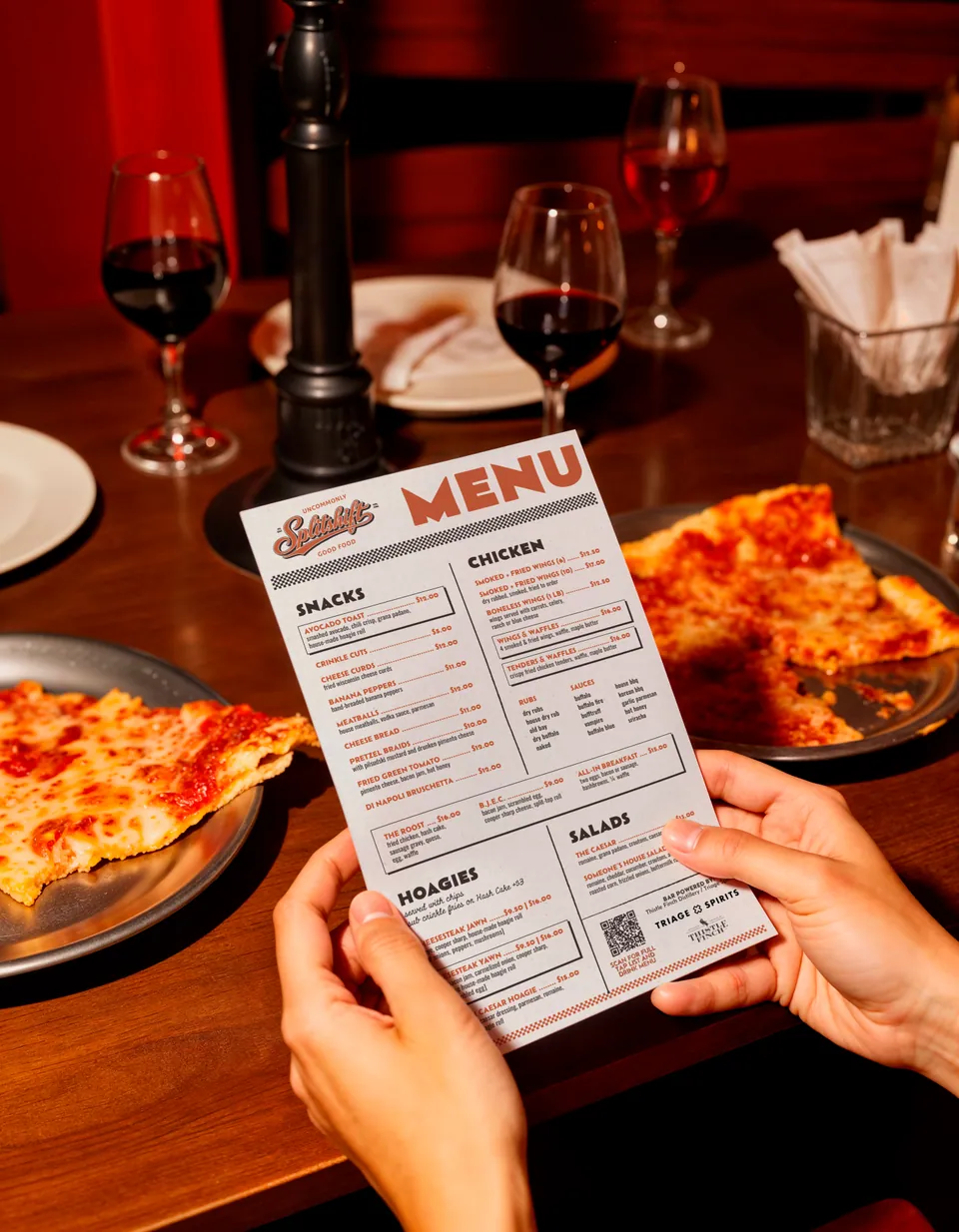
The printed menu introduces a denser reading task than the packaging. It has to present categories, dishes, descriptions and prices while still feeling like part of the restaurant.
This is where identity and information design meet. The visual character should help connect the piece to the brand, while headings, spacing and text sizes help someone use it.
Reviewing the menu alongside the packaging makes that distinction visible: the same business, expressed through materials with different jobs. See our menu design service for the practical scope behind those layouts.
What the work shows.
A distinctive name
The script wordmark gives the identity a recognisable centre across the set.
A repeatable language
Colour and checkerboard provide supporting elements that can be used in different proportions.
Flexible applications
Each format has its own layout, with the shared identity making the relationship visible.
The result is a connected family of restaurant materials. The photographs show the design in its applications, from the broad pizza box to a smaller takeaway cup.
Hear from Splitshift.
Philip Given, co-founder of Splitshift and The Pretzel Company, shares his experience of working with AVEM NOCTIS in the customer stories on our homepage.
Watch Philip’s customer storyPlan your own identity.
Start with the places your customers will encounter the business. A logo needs the right supporting colours, type and examples to work consistently across them.
Explore our brand identity design service for scope and process, or use the small business brand-kit guide to plan the files and guidance your team needs.
Let’s shape your identity.
Tell Ivana and Levent what your business does, who you want to reach and where your identity needs to appear first. We’ll use that to propose a scope.
Discuss a brand identity projectPrefer email? Write to our studio.