
Splitshift
packaging design.
From the table
to the takeaway.
A closer look at AVEM NOCTIS’s packaging and print work for Splitshift: a pizza box, takeaway bag and cup, connected to the menu and coaster through a shared visual identity.
Explore packaging design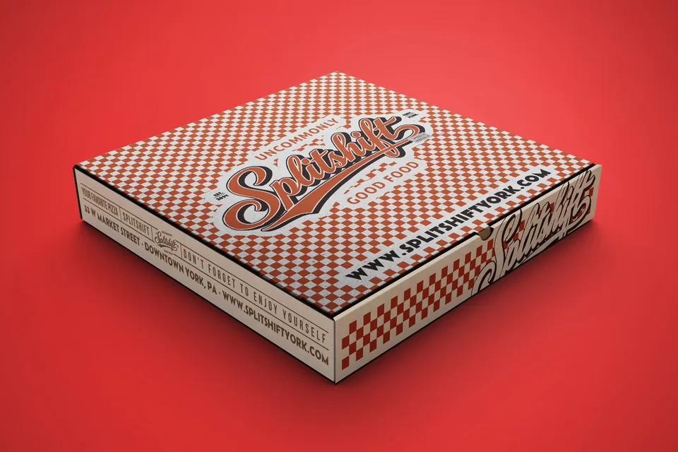
The pieces in the set.
The portfolio brings together five distinct surfaces: a broad pizza box lid, a tall carrier bag, a curved takeaway cup, a small coaster and a printed menu.
Each object is handled and read differently. The design task visible in the finished work is to carry a recognisable character through those changing proportions, while giving each piece its own composition.
A shared visual language.
The script wordmark, red accents and checkerboard pattern give the set its continuity. White space changes the pace from one object to the next: densely patterned on the box, more open on the bag and cup.
This case study examines the finished packaging and print shown in our portfolio, focusing on how those elements are applied across the set.
The pizza box.
The lid gives the checkerboard pattern its largest continuous surface. The central wordmark sits across that field, while lettering and pattern continue onto the edges. Seen closed on a table, the box presents a broad expression of the restaurant’s identity.
The sides become part of the composition rather than an afterthought. They carry supporting information around the object, where it can remain visible when boxes are stacked or the lid is viewed at an angle. A packaging layout has to account for those changing viewpoints.
The takeaway bag.
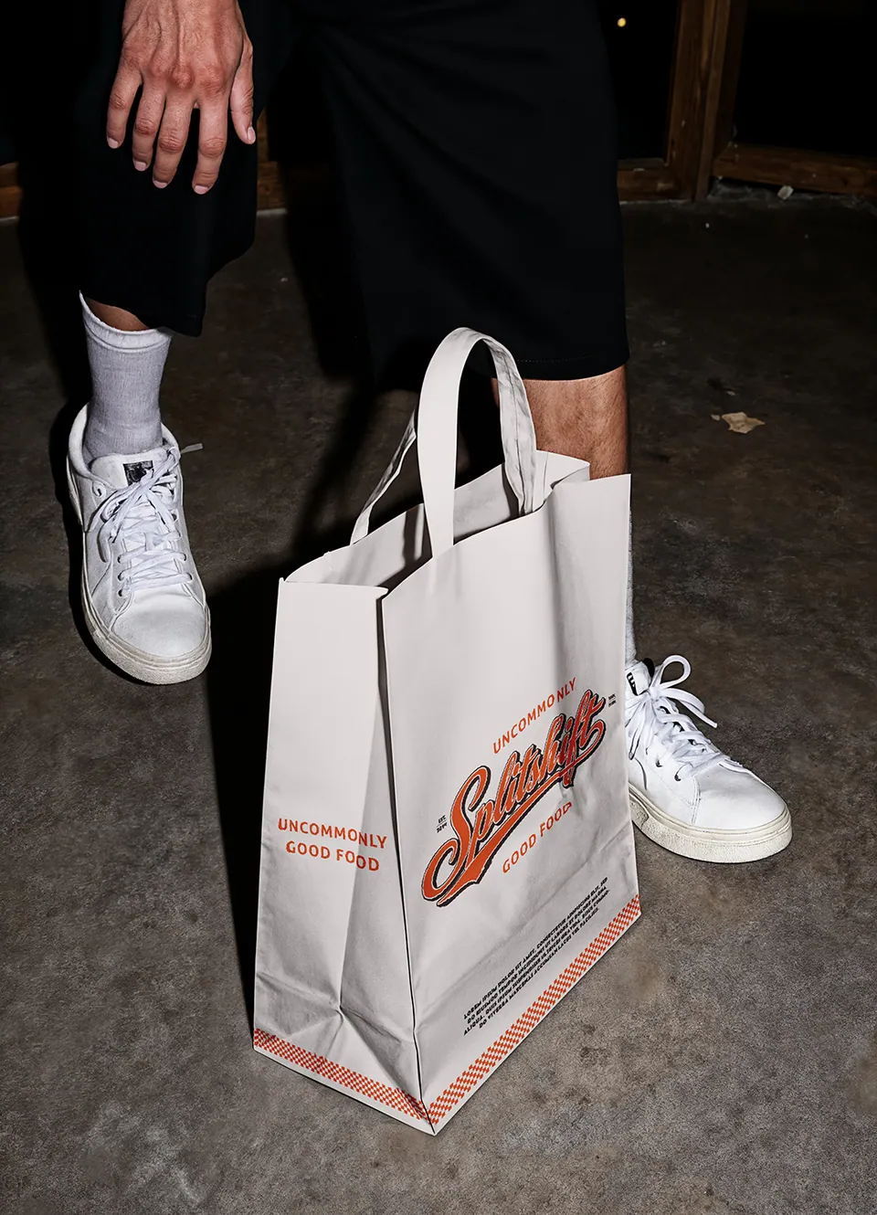
The bag changes the balance. A large white front lets the script identity stand on its own, with the checkerboard gathered into a band near the base.
That quieter layout suits a tall object with handles and folded sides. It keeps the central identity easy to distinguish without filling every available surface with pattern.
Placed beside the box, the connection is clear. The shared elements do the work; the layout is allowed to change. For a packaging family, that flexibility matters more than making every item look like a scaled copy.
The takeaway cup.
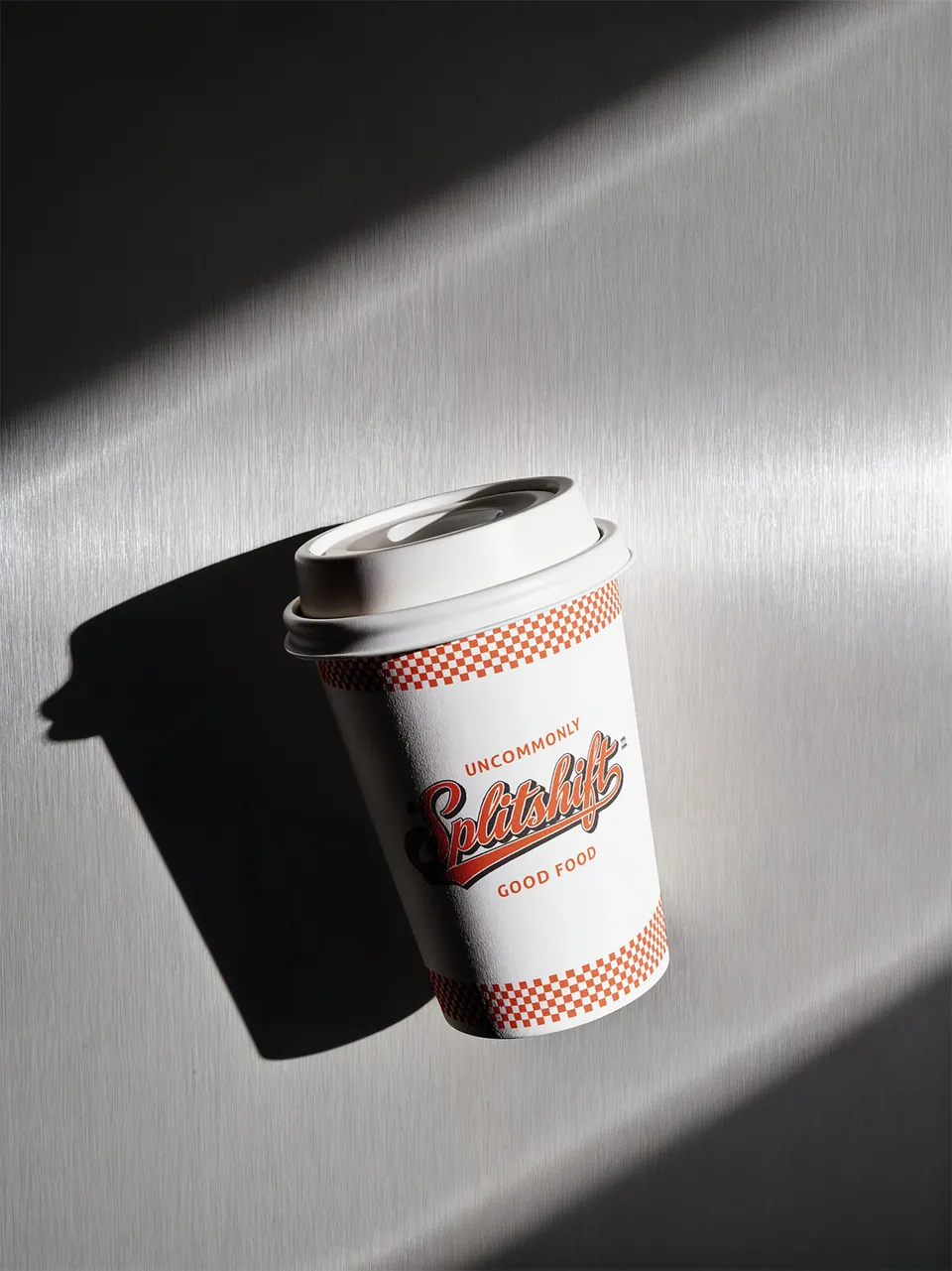
The cup brings the same identity onto a curved surface. Checkerboard bands near the top and bottom frame the script wordmark and its supporting lettering.
The central white field gives the lettering room, while the bands establish a connection around the cup. This is a different use of the pattern from the all-over treatment on the box.
The comparison shows how the amount and placement of a graphic element can change while the character stays recognisable. The surface, proportions and viewing angle help determine the composition.
Back at the table.
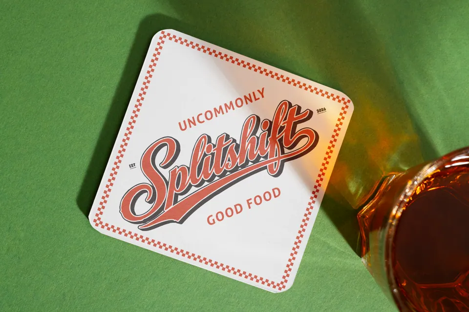
The coaster brings the identity into a smaller tabletop format. Its compact surface calls for a focused arrangement, with the brand given a clear place in the composition.
Including it in the same review as the packaging makes the relationship between dine-in and takeaway visible. A customer can encounter the restaurant through a drink at the table or a bag at the door; those pieces should feel related.
The set demonstrates that a packaging project can extend naturally into supporting print when the shared visual elements are considered together.
The printed menu.
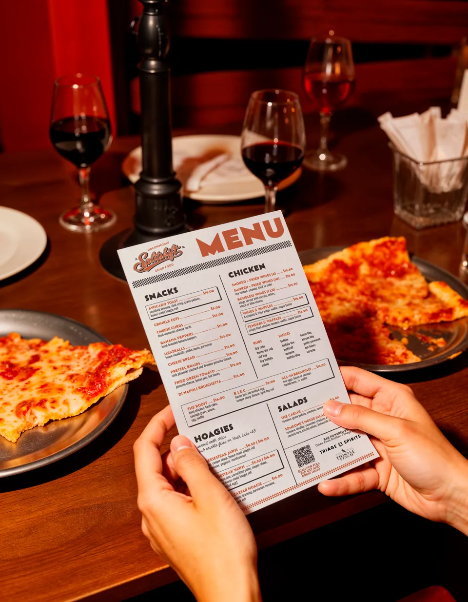
The menu has a different priority: it needs to present food, descriptions and prices in a readable order. Its structure gives the content space while carrying the same personality as the surrounding print and packaging.
A broad patterned field works on the pizza box because the lid has relatively little information to convey. A menu needs a more deliberate reading hierarchy. The identity supports that hierarchy rather than filling every part of the page.
See our restaurant menu design service for the formats and process behind this type of work.
What holds it together.
Recurring elements
The script identity, colour and checkerboard establish the relationship between the objects.
Different proportions
The broad box, tall bag and curved cup use different arrangements of those shared elements.
Room for purpose
Packaging gives the identity a visible presence; the menu also has to organise a substantial amount of information.
The finished set shows a connected family of packaging and print, with the layout adapted to the job of each piece.
Hear from Splitshift.
Philip Given, co-founder of Splitshift and The Pretzel Company, shares his experience of working with AVEM NOCTIS in the customer stories on our homepage.
Watch Philip’s customer storyPlanning your own set?
Start with a list of every surface customers encounter: the packaging they carry, the menu they order from and the print they see at the table. Identify what can be shared and what needs its own layout.
Our restaurant packaging design service explains the scope, supplier templates and briefing materials. If menus are part of the project, the menu design brief guide helps organise that content.
Let’s work on your packaging.
Tell Ivana and Levent what you serve, which packaging you need and when you plan to launch. Include your supplier’s templates if you have them.
Request a packaging design quotePrefer email? Write to our studio.